Getting Started
Before we start, I want to note that Photoshop is a vast program that people have written literally volumes about, so this lab will really only be scratching the surface. However, it will cover most of the functions that will be most useful in the context of this decal. If you are only interested in editing, do at least skim through the Drawing portion, because it covers a lot of basic functions that you’ll need to know later on. (And besides, Photoshop skills are a resume builder.)
First, open up Photoshop, and click on New or Ctrl+N. Depending on what version you have, your screen probably looks something like this:

Most of the settings, like Resolution and Color mode, aren’t necessary for the scope of this class, so we’re going to ignore them for now. You’ll notice that you can rename and change the size of the image. I’m going to set mine at 300 x 300 pixels. (The dropdown menu lets you adjust the units from pixels to something else, like inches or centimeters, if you’d prefer.)
Once you’ve created a new document, you’ll arrive at your main workspace. The default layout looks something like this. The center of your workspace is your canvas, which will be where your actual image is. Focus on the menu bar for now.

The menu bar includes some important functions like Save and Undo that you’re probably familiar with. If you’re unhappy with the size of your canvas, you can adjust the canvas size under Image > Canvas Size. Note that changing Image > Image Size will RESCALE your image, while Canvas Size will adjust your workspace by cropping/adding empty space.
Once you’re happy with the size and shape of your canvas, proceed to the next page.
Part I: Drawing in Photoshop
If you’re new to image editing software, that toolbar probably looks scary, but fret not! Drawing in photoshop is as simple or complex as you want it to be. To start your masterpiece, look to the Layers window in your workspace, which is probably in the lower right area.

Your new document will only have a Background layer, which is usually annoying to work with, so we’re going to create a new layer by clicking the icon that looks like a piece of paper with its bottom-left edge folded. (You can also create a new layer by going to Layer > New > Layer or Shift+Ctrl+N.)
You may have worked with layers before in other software. They are typically a way of grouping and ordering components. In Photoshop, this means that they operate like sheets of transparent paper stacked on top of each other. Drawing on one layer will not affect the other layers, and you can reorder them to change which shows up on top.
To demonstrate, we’re going to create three circles of different colors. You’ll create the first circle on this new layer that you’ve made. To start with, rename your layer by double-clicking the name Layer 1 in your Layers window. While not necessary, renaming your layers helps with organization.
Then, set the desired color for your circle. You can do this by double-clicking the first of the two overlapping squares near the bottom of your toolbar:
The square in front sets your foreground color, which is the color that is usually used. The square behind sets your background color, which is only used in a few circumstances, such as gradients, which we don’t need to worry about for now.
(You can swap the two with the double-sided arrow, or reset them to black and white by clicking the mini black-and-white squares.)
As you can see, I’m using red right now. (Later, if you want to select a color you’ve already used, you can use the Eyedropper Tool on your toolbar as well.)
Once you have your color, find the Brush tool in your toolbar, which looks like this:
The brush tool will be your main tool for drawing, and you can adjust it in a variety of ways in the settings right under the Menu bar.

The second dropdown option (where the 3 is in the image) lets you change your brush size, hardness (how “blurry” the edges are) and tip (the brush’s shape). Opacity affects how transparent/opaque the brush marks are. You can play around with the settings until you’ve made a circle (or other shape) that you’re happy with.
(Here’s mine.)

Next, find the shape tool in your toolbar (it probably looks like a rectangle) and click and hold. You’ll see several options. I am going to create another circle, although you can use any one you’d like.

Make sure you change colors, then make a circle or your shape of choice by clicking and dragging. (You can make a perfect circle/square by holding down Shift as you go.) Once you’re happy with your shape, press enter.
You’ll notice that doing this automatically creates a new layer. Try to draw on your new layer with the brush tool--you’ll also notice that Photoshop doesn’t let you. This is because Photoshop treats it as a vector shape rather than as pixels. Text will also behave the same way. In order to edit the layer normally, right click on the layer and select “Rasterize Layer.”

Now find your Move tool in the toolbar (or press V). With this, you’ll be able to drag around the circle on whatever layer you’re on. Move the circles so they’re partially overlapping.

Then click and drag the layers so that whichever layer was below is now on top. Your circles should have also switched positions, like so:

As mentioned, layers in Photoshop are visually “stacked,” and if transparent, will display whatever layers are below. Transparent space is represented in Photoshop with a grey and white checkered pattern, which you’ll see in the layer icons.
You can also hide layers by clicking on the eye icon next to each layer:
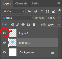
Hide the Background layer, and you’ll see that most of your canvas is probably transparent. You can also lock the opacity of a layer with the square icon right next to “Lock,” which means you’ll only draw on areas that are not transparent on that layer.
Last but not least, we’ll make our final circle with the Lasso tool. It is probably the third icon in your toolbar and looks like a lasso. The lasso tool is one of several selection tools in Photoshop and lets you “draw” an area to select.
To test this out, select a portion of your circle and move it around with the move tool (make sure you are on the right layer for the circle you’re trying to select). Use Ctrl+D to deselect.

(If you want to select a perfect circle or square, use the marquee tool right above the lasso tool instead, which looks like a dotted shape. The magic wand tool, on the other hand, selects everything of a certain color or range of colors. You can play around with both of those, too.)
Use a selection tool of your choice (I will stick with lasso) to make another shape on a new layer. Then use the Paint Bucket tool (shortcut K) to fill it in with a new color.
Now we’re going to merge all the layers. Do so by selecting all the circle layers (hold Shift or Ctrl) and right click. Select Merge Layers.

This will make all your layers a single layer. Be careful, as this also means that you may lose parts of the layer that were hidden under other layers.
Now that you’ve learned how to make some basic shapes, we can move on to things like shading and light. One way to do this, obviously, is to use your brush tool to lay down the colors you want, but Photoshop also has a lot of handy tools to help you shade quickly and efficiently. One such tool is layer modes.

If you click on the dropdown menu, you’ll see a ton of strange and confusing names, and the fastest way to figure out what they do is just to try them out. Start fresh by deleting your old layers and creating a new shape.

Here, I have a circle. On a new layer, I’m going to shade the circle roughly where it would be darker if light hit it from the top right.

This is what my second layer looks like. (Notice the transparent parts. The top half of the circle is white because I duplicated the first circle, locked transparency, and colored it white & purple where I wanted. This is because the Multiply mode, which is what we’re going to use, ignores white. There are a lot of other ways to only color on the areas you want, such as with selection tools.)
Once I set the top layer to Multiply, my image looks like this:

I can do the same thing with screen to make a highlight.
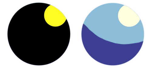
(Left: Normal Mode; Right: Screen)
(Properties of light & color theory can be pretty complicated, but if you’re not sure, you’ll usually be fine if you use the color of your background for shadows and the color of your light source for your highlights, making sure that one is warmer and other cooler.)
There are tons of layer modes, so experiment! Try different layer opacities (right next to Layer Mode), combinations of colors, etc.
Side note: the Burn and Dodge tools
Beginners tend to gravitate to a few tricky Photoshop tools in particular, which are the burn and dodge (and sometimes the sponge) tools. (I did this, too.) This is what my circle looks like if I use those to shade and highlight:

Part II: Editing in Photoshop
If you would rather work with traditional mediums, Photoshop can also be incredibly useful for letting you display your artwork digitally the way you want it to look. To demonstrate, let’s start with this horrible quality photo of a pencil drawing:

It’s badly centered, weirdly yellow, and has bits of other things sticking into it. So the first thing we’re going to do once we open it in Photoshop is crop out the unnecessary parts.

Once you click on the Crop tool, you can crop out the unnecessary parts and rotate it so it’s in the right direction.

Oops! We’ve still got those weird black edges. And you’ll notice that the image is on a background layer, which is annoying to work with. You can change it from a background layer to a normal layer by holding Alt and double-clicking on the layer.
There are a couple ways to fix the black edges. In this case, we’ll just fix it up with a quick brush job, since in the end, we want that area to be completely white. (If you want to preserve the texture of the paper, content-aware fill or the clone stamp tool might work, but it could also look strange. It would be easiest just to make sure you don’t draw too close to the end in that case.)
To get the color you want, click the brush tool and Alt+click to use the dropper tool. (It will revert back to the brush tool once you let go of Alt.)

The areas that were brushed up will look kind of strange and flat, but that doesn’t really matter, since in the end, we want a completely flat white anyways. This is just to make sure that when we layer adjust, the difference in darkness/value doesn’t mess up the adjustments. Before we do that, however, I want this image in black and white so the strange lighting doesn’t mess up the image.
(This step is especially important when making your animatic, if you chose to storyboard in pencil. Unintentional shifts in lighting can make your images much darker, lighter, warmer, or cooler than you intended, which can make your animatic hard to follow or cause unintentional mood shifts.)
There are a couple of ways to do this. If you remember how to use layer modes from the previous section, you can make an all-black or all-white layer and set it to Saturation, since black and white (and any grey on the farthest left of the color wheel) have no saturation. This time, however, we’ll use adjustment layers to do this.

Clicking that semicircle icon (or Layer > New Adjustment Layer) will allow you to select from a wide range of options. To make the image black and white, we’ll pick Hue/Saturation. Once you’ve made your adjustment layer, a window like this will pop up:

It might be a pop-up, or it might be in one of your sidebars. Either way, move the Saturation bar to the furthest left, as depicted above. Once you’ve done so, your image should be in grayscale.
Next, you’ll want to create another adjustment layer in order to make the pencil pop, and the background pure white. Both Curves and Levels will do this, but Levels is a little easier to start with, so we’ll do that. Make a new Levels layer the same way you made your Hue/Saturation layer, and you should see something like this:

You can play around with the different triangles to see what they do. The arrangement above is what I ended up with. The resulting image looks like this:

After that, I can just use the brush tool on a new layer to fix that weird black spot, and I’m done.
Obviously, this method is for black-and-white images, such as your storyboard will be, but these tools can be used in a lot of ways, such as by adjusting the colors on paintings or even tweaking a digital piece. You also may not want your storyboard to be as sharply black and white as the above image turned out, but you can still use similar methods to make sure all your images turn out the way you want them to. Play around with the different adjustment layers and figure out what’s useful to you!
Side note: Lineart
If you want to color under your pencil art, you can do so easily from here. Just group all the layers you just made into a single folder (the New Folder button is right next to the New Layer button) and set the entire folder to Multiply. Then create a new layer(s) underneath it and color however you like. You should be able to do something like this:

Part III: Animation
We will be covering animation later in the semester, so this section is only here to introduce the animation tools in Photoshop. Also keep in mind that while Photoshop supports animation, it is not its primary purpose, so it can be very clunky in that regard. Photoshop animation works best for short sequences that involve a lot of complex images, like painted gifs.
You can access all the tools by going to Windows > Timeline in the menu bar. (Incidentally, for a more animation-friendly workspace, you can also try Windows > Workspace > Motion. Rearranging your workspace to suit you can make Photoshop a lot more streamlined and a lot less intimidating.)
When you begin, your Timeline will look something like this:

Video Timeline mode looks like this:

It’s organized primarily according to the timeline and works in layers. On the other hand, Frame Animation mode looks like this:

Frame animation is organized mostly according to frames, whose length you can adjust in the bottom right corner of each frame.
You can switch between the two modes with the icon in the bottom left of the Timeline window, but this can cause issues if you’ve already started animating, so it’s not suggested.
We’ll cover animation with Photoshop in a more in-depth fashion later, but If you’re interested in playing around with animation ahead of time, Photoshop and Flash are both great ways to start!
Part IV: Extended Topics
As I’ve noted before, Photoshop is a huge program with a lot of different tools which would be impossible to cover in one class. If you’re interested in creating art digitally, here are a few more topics you could consider looking into, either with a quick Google search or by asking facilitators.
Masks: Want to hide part of a layer? Or block out part of an adjustment layer? Try masks!
Brush Settings: Don’t like the brushes that Photoshop came with? Play with brush settings, or make your own custom brushes!
Swatches: Do you want to make a custom color palette that you can use for multiple projects? Try customizing swatches.
If you have any questions at all, please ask a facilitator! We can be contacted by email, after class, or during office hours!